National Trust Poster
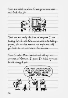
Diary Of A Wimpy Kid Extract
Frube Yogurt Box
Analysis
I chose to group these 3 texts together based on their audience. The national trust letter is aimed at young children no older then '11 3/4'. The next image is an extract from the book 'Diary of a Wimpy Kid'. The book is targeted to children of ages 8+ who are reluctant to read. The final text is children's magazine. All of the texts use graphology to attract the audience which is important because young children won't read a big chunk of writing but will be drawn to images which are either colourful or communicate a message.
The National Trust poster uses bright colours which stand out to the audience. The green reinforces The National Trust theme of being fresh and natural. Other graphology that is targeted towards the audience is that there are a range of photographs of young children so the reader can see who the poster is specifically aimed at. The paint splats and the messy background are also informal and something a child of that age would create. There is also a cut out game designed for children. The text is simple and easy to read. A rhetorical question makes the reader think and it is specifically aimed at children because they are thinking about their future when it says 'Do you want to be the next David Attenborough?' The sub-headings make it easier to read as the colour segregation and bold titles.
The book extract uses work like 'gonna' and 'gramma' is not only slang that younger people might use, but is also phonology of how the words would be pronounced in a sentence by children. Like the other texts, the graphology of the extract is what stands out and makes it clear who the target audience is. The simple cartoon drawings are child-like and don't use a lot of detail. The font of the writing also looks like children's handwriting, wobbly, uneven and not on the lines of paper. The speech bubbles make the dialogue clearer. The basic layout and simple text is aimed at children.
The magazine cover advertises an education yet fun brand for children. 'Horrible Histories' uses lots of alliteration so that it is memorable and provides emphasis . For example, 'ruthless romans', 'foul & funny facts', 'gruesome gifts'. Also, rhyming is used, e.g. 'mean queens' which teaches children the right pronunciation of words and helps them to remember the message that the rhyming is trying to communicate. Like the poster and book extract, the magazine cover uses graphology to portray the ideas and genre. The variety of cartoons are informal and amusing to a younger audience so it is obvious the audience are children. The large amount of colour will also stand out to the audience.


Nicely done - good texts and intuitive comments that show a good grasp of some of the new concepts and terms you've picked up since starting the course. I want to see you working on:
ReplyDeleteAO1 - varying the frameworks that you use here - you write really well about the graphology that these texts are employing here, but almost to the extent that you've almost grouped these under 'use graphology'. Graphology is nice and all, but a student aiming for an A needs to be stretching themselves with comments on lexis/grammar and other devices perhaps. Similarly, sometimes a lot of the ideas and features you identify feel a bit disconnected - look to use words like "reinforces" or phrases like "further creates this impression" to show you understand how effects can be built and established across a piece.
AO3 - some good comments on context here, and I like the idea that the 'Wimpy Kid' book is perhaps aimed at reluctant readers: this could be expanded on perhaps! I'd like to see your ideas about context becoming more tentative as well - "young children won't do this" is a little bit forceful and bombastic. Look to use "might" and "could" to soften the edge of your ideas a bit.
It's good work though - these comments are designed to push you towards those top grades here!