Monday, 9 December 2013

Language & Power- Written

How is language used to assert power?
The text is produced for local residents of Bishops Waltham with a duel purpose to primarily persuade the reader to write a letter campaigning against a new corporate construction, and a secondary purpose to inform the audience of the damage that the construction will create. The context of production gains influential power of the audience as the text has a professional formality, using planned and computer written speech, which asserts power as the reader knows that the producers are serious about the topic. The context of reception will be residents receiving the letters via their own homes or viewing it as a poster when they are walking past. The poster gains power over the audience through the reception because of the graphology it uses, including the bold red box and heart.The text is recently produced, suggested by the statements such as 'time's running out', 'today', 'time is short' and 'deadline' so asserts power over the reader because they may feel as if they are being pressured.
 
'You must', 'remember' and 'write now' are examples of modal verbs, used to gain authority over the targeted audience, residents of a local community. The obligatory words suggest no alternative choice for the reader and intimates the audience to feel as if their decision has a big effect on other factors. Bold font and colour is used to make these imperatives stand out and reinforce the importance of the audience obeying the text. Personal pronouns such as 'our' assert power because the audience feel connected to the producer, and the use of direct address such as 'you' makes the reader feel as if they are single out and an individual duty to obey the poster.

The graphology of the text exerts power because the bold slogan in black with white writing, red stand out boxes, bold highlighted text and heart image all assert power. the clock image creates an imagery to the audience of how they are being rushed, meaning the producer has influential power on the audience to take quick actions. The bold, highlighted text and stand out boxes attract the reader, also influencing them to read further into the letter.


Tuesday, 26 November 2013

Revolutionary Road Clip - Power

https://www.youtube.com/watch?v=n2lTpPptOWA

April and Frank, the main characters in the film, are having an argument about their feelings for one another. In this scene the power differs until the end of the clip where Leonardo Dicaprio holds the power through his language.

When he repetitively asks her name, and she doesn't answer, this is in example of her asserting her power. By ignoring him, and laughing, she is implying that what he is asking isn't important and he seems weak because he can't hold her attention. April also uses short declarative sentences like 'But I don't. I hate you' which is blunt and doesn't need explaining. This asserts power because she is to the point and doesn't try to be subtle about her feelings.

'What the hell are you doing..?' 'Why the hell...?' and 'Why..?' are examples of Frank having influential power by on April. He has this power because he asks her rhetorical questions to threaten her face, a theory by Brown and Levinson. By being inquisitive, Frank demands answers from April to make her think about her actions and realise that she is the weaker subject.

'Listen to me' is an example of Frank using imperatives, a way to also assert his power. By giving a declarative sentence as an instruction, April is in a position where she is obliged to do as he says. Frank also says 'I've got news for you' exerting his power by seeming more educated and that April hasn't come to an obvious realisation because she is less knowledgeable and conveyed as slow and naïve.

Thursday, 7 November 2013

The X Factor – ‘How is this transcript typical of spoken language?’


The X Factor – ‘How is this transcript typical of spoken language?’

A range of spoken linguistic features appear in the transcript to make it obvious that the text is a verbal transcript.

The first example of spoken language in the transcript is accent and dialogue. Louis says ‘ya’ which is a typical Irish trait of its accent and wouldn’t be seen as that in written language. Also, Tulisa says ‘smash it’ and ‘tore it up’ which is dialogue used most commonly by young people and the regional location of where she is from. In spoken language, it is easy to identify where someone is from by what they say and the way they say it.

3 out of the 4 judges on the show address Mischa first when they start talking. This is an example of spoken language because in written language, the context makes it clear to the reader who is saying what. In spoken language, it can be difficult to recognise who is talking to who without addressing the reader and with no other clear communication, such as eye contact and body language, to make it evident who the target is.

Each speaker in the text uses pauses, (.) or (1) etc., when talking. Because speech is spontaneous, the speaker takes gaps to think about what they are going to say next. The pauses are most common when changing the topic from one point to the next, for example, the judges are being very complementary of the contestant and tend to hesitate more when giving a criticism. They might have to think more about what they are going to say without causing a conflict or implying the wrong meaning. This happens when Tulisa says ‘(2) erm (.) the truth is Mischa (1)’.

The point of being more hesitant when addressing a problem links to the hedging of the judges. Not only do the judges take more pauses, but they try and avoid saying their honest thoughts by implying something else when giving a criticism to Mischa. For example, Tulisa says ‘The true is Mischa… anything I say to you is only because I want you to be the best you can be…the point that I was trying to make…’ this section of the text is a typical example of hedging in spoken language because Tulisa might feel under pressure from other things, such as the other judge’s complimentary comments, what the media might say, or audience reaction, that she has to be careful about critiquing Mischa so that she doesn’t create a negative image for herself. 

The transcript also includes examples of downward converging. For example, Louis says ‘you put it down baby girl’. Considering Louis Walsh’s background and reputation compared to Mischa’s, he is downward converging by making conversation but talking at her level of dialogue and trying to fit in with her type of social group and speech. He might want to do this to appeal to the younger audience by relating to that age and social group’s speech, and make him seem likable by being comical. This is apparent in spoken language where speakers adjust their speech towards or away from one another at a different level.

Holding the floor, in which one speaker is in control of the conversation, is often seen in spoken but not in written language. An example of this in the transcript is when Alexandra Burke says ‘remember, it’s it’s a ladder’, she is holding the floor by keeping the contestant in form and making sure she isn’t being over-confident. She wants to control the situation so her advice is heard and that she is in a higher position because she has already had experience in the situation.

Finally, Brown and Levinson’s building the face theory in also included in the transcript. The judges are very complementary of Mischa and so this is building her face, implying that she is being welcomed into their ‘group’ of likeable musicians.

Wednesday, 2 October 2013

Categorising Texts Response #1

National Trust Poster
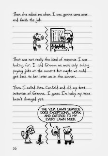
Diary Of A Wimpy Kid Extract
 
 
 Frube Yogurt Box
 
 
Analysis
 
I chose to group these 3 texts together based on their audience. The national trust letter is aimed at young children no older then '11 3/4'. The next image is an extract from the book 'Diary of a Wimpy Kid'. The book is targeted to children of ages 8+ who are reluctant to read. The final text is children's magazine. All of the texts use graphology to attract the audience which is important because young children won't read a big chunk of writing but will be drawn to images which are either colourful or communicate a message.
 
The National Trust poster uses bright colours which stand out to the audience. The green reinforces The National Trust theme of being fresh and natural. Other graphology that is targeted towards the audience is that there are a range of photographs of young children so the reader can see who the poster is specifically aimed at. The paint splats and the messy background are also informal and something a child of that age would create. There is also a cut out game designed for children. The text is simple and easy to read. A rhetorical question makes the reader think and it is specifically aimed at children because they are thinking about their future when it says 'Do you want to be the next David Attenborough?' The sub-headings make it easier to read as the colour segregation and bold titles.
 
The book extract uses work like 'gonna' and 'gramma' is not only slang that younger people might use, but is also phonology of how the words would be pronounced in a sentence by children. Like the other texts, the graphology of the extract is what stands out and makes it clear who the target audience is. The simple cartoon drawings are child-like and don't use a lot of detail. The font of the writing also looks like children's handwriting, wobbly, uneven and not on the lines of paper. The speech bubbles make the dialogue clearer. The basic layout and simple text is aimed at children.


The magazine cover advertises an education yet fun brand for children. 'Horrible Histories' uses lots of alliteration so that it is memorable and provides emphasis . For example, 'ruthless romans', 'foul & funny facts', 'gruesome gifts'. Also, rhyming is used, e.g. 'mean queens' which teaches children the right pronunciation of words and helps them to remember the message that the rhyming is trying to communicate. Like the poster and book extract, the magazine cover uses graphology to portray the ideas and genre. The variety of cartoons are informal and amusing to a younger audience so it is obvious the audience are children. The large amount of colour will also stand out to the audience. 


Sunday, 29 September 2013

Trugill/ Labov/ Tidholm- English Dialect

The dropping of 'ing', pronounced 'ng' through the nasal, was investigated by Peter Trugill in the 70's. He examined this theory on 5 groups of society:
-lower working class
-middle working class
-upper working class
-lower middle class
-middle middle class
-males
-females
I predict that Trugill found that this dropping of velar nasal 'ng' was found in the dialect of mainly males in the lower working class because its suggests quicker talking and that this is a feature of accent. People in upper classes tend to be overt prestige and want to sound more standard English, whereas males in the lower working class are proud of their accents and dialect, and the sense of individuality in their society so would carry this feature.

Labov researched the 'r' pronunciation in New York dialect, investigation this theory in 3 shopping stores in the 1960's. It was considered that to have vocalization of the final 'r' was recognized as having high status. He went into Saks (expensive New York store), Macy's( (middle class store) and S. Klein's (cheapest of the 3 stores). He asked shopping assistances a question about where an item would be in the store and they would answer with a floor number. He would ask them to repeat their reply, as if he hadn't heard their response. He would then go off and record their dialect. He found that the Macy's would pronounce 'flo-ar' the most, showing that the most expensive shop, had the most overt prestige New York accent. This feature of dialect decreased as the stores got cheaper. In Macy's it was most apparent that when asked to repeat themselves, shoo assistances would use this vocalization.

Thomas Tidholm studied the definite article reduction in dialects. In particular, the Yorkshire dialect was know for this feature, e.g. t' instead of the. He found out that the older generation used this form of dialect and it was majorly men over women and was spoken by middle-class/working-class families. In 3 years time, Tidhom predicted that definite article reduction will not be part of dialect in 3 generations time.

Sunday, 22 September 2013

Galaxy/The Devil Wears Prada Magazine Advert

The text implies that it is produced for adult women. This is because the context of the film that is advertised is aimed at women. 'Prada' is a well-known fashion company that women would take an interest in. The graphology also contributes to the target market. The high heel shoe, luxurious colours and background create a feminine image. The text has a dual purpose to persuade as its primary purpose and to inform as its secondary purpose. The text persuades the audience to buy the Galaxy product because there is a prize to be one. 'WIN!' is centred in the middle of the page to draw the eye in and the competition offer will make customers want to buy the product. By linking the two topics together, a joint awareness for the product is created, persuading the audience to see the film, and to buy the product. The product informs the reader by stating the date of the film release and facts about the competition. The advert is computer produced as it looks very professional and although it isn't a recent advert now, at the time it would have been because of the competition dates and the limited time promotion. The advert will be seen by magazine readers.

The text is a formal register because if the complex words used like 'indulgent' and by the appearance and purpose of the advert. Lexical fields such as 'indulgent' create an image for the product and 'devilishly' implies the product is too good to resist, as well as linking with the topic.

The text is written in the present tense to let the viewer know that the advert is promoting a current topic.

There is an implicit meaning to the text which is the target audience. The graphology and the feminine words used don't directly address the market as being females but it is an obvious relation.

The discourse structure of the text is organised as headings then smaller texts. This effects the reader because they are drawn into the larger more attractive texts which stand out and then it will encourage reading the smaller texts.

The graphology helps to reinforce the purposes of the text. The images draw the eye of the reader to persuade them to be aware of the product. The 'luxurious' fonts and smooth background effect with the prongs of the heel digging in to it, captures the context of both topics in one advert.

Tuesday, 17 September 2013

Church Sign Analysis

Church Sign Analysis

The sign has a dual purpose. The primary purpose is to persuade the audience, both church members and passers by, to help the church renovations. The sign does this by using big bold text that is larger then the other texts to show it is important and to stand out. The yellow reinforces this aim. The sign states that the church needs 'YOUR' help. This may effect the public and encourage them to volunteer as the sign implicates desperation. 'Please come inside to find out why and how' also encourages the viewer to take a look so achieves its purpose. The secondary purpose is to inform the public about its history so that the audience can understand the need for the persuasion. The sign was professionally made as it is computer designed and produced. The sign clearly and effectively achieves its purpose of persuading and informing. The sign is reflective on the time it was made because it 'urgently' needs help so is a recent production. The sign will be received when people travel past the church.

The sign is formal as standard form English is used. The appearance of the sign is also formal and professional. 'St Stephen's Church' links the sign to the topic.

The sign is written in the present tense as it communicating a current and recent issue. The 1st person is used to describe the topic as it creates a more emotional attachment to the public. Examples such as 'I now urgently needs you help' and 'please' are used to implicate the desperation the church is facing.

The text tis chronologically organized in stating its history, and also to inform then to persuade. The name of the church is used as a heading to clearly inform where the problem is and draw people who know the location into the sign. Altogether, the text doesn't include many headings or sub-headings as all the text is the same size.

The sign does include some politeness features such as 'please' but this is more of a desperate request instead on an ordered request.

The sign doesn't include much graphology. This will attract the target audience as mainly children will be interested in images and the church doesn't want children's help but keen adults. The main information is big, bold and yellow to stand out and draw the eye to the key features.

Thursday, 5 September 2013

Text 10: Informal Letter

Audience- A customer of the business who has just bought a batch order.
 
Purpose- To inform the customer of what they have ordered and information about deliveries. Information about the business including contact details, and business titles.
 
Format/Layout- Jargon such as VAT is used to imply the business is professional. The layout is structured and correct grammar and punctuation is used. The letter is addressed to 'Mr Smith' rather then using a first name. The letter is polite and clear.

Text 9: Barack Obama Speech

http://www.youtube.com/watch?v=ANaLtzP2tLc

Audience- American citizens who are going to vote for president. People that believe 'everyone should get a fair shot', 'do their fair share' and 'play by the same rules'.

Purpose- To persuade the audience to vote for him. He relates to the audience and repeatedly unites the nation saying 'if you share that faith with me, if you can share that hope with me', 'your voice must be heard in this election...you need to stand up in this election', 'our path is harder...our road is longer but we travel it together'. He wants to involve the audience in the vote and make it about them, persuading them to vote and have a continuous involvement in running the country. 'I ask for your vote' and 'I need you to vote' persuades people to vote for him because it shows he can't do it on his own and he needs support.

Format- Opening/Middle/End

How is power exerted?- Barack Obama is very enthusiastic and has charisma so makes others feel that he is talking to them personally. He is clear on his choices and ideas which makes a strong and determined leader. He is very likeable which gives him authority also.

Wednesday, 4 September 2013

Text 8: Children's Storybook

Audience- The target audience is probably young children who are girls. The book itself is about fairies which would be appealing to this gender and age group. The text is very simple and so would be for an early ready. The text uses alliteration when describing the fairies and their movements 'fabulous fairies' and 'frantic fanning' are used to create a rhythmic memory is children's minds.

Purpose- The primary purpose of the book is to entertain the audience. There is lots of graphology that would appeal to the audience as would draw their eye and make them enjoy reading. The secondary purpose is to teach; the writer wants the audience to be able to establish colours so has put them in a bold font.

Format/Layout- The colours of the book are all very feminine. The colours link to the bold words. There are stars and sparkles to reinforce the theme of fantasy. The imagery is simple and not detailed as the audience want basic images to tell the story not detailed graphics.

Has the gender of the audience or producer influence the text?

 I think that the gender of the audience has influenced this text because the language used is very elegant and soft, e.g. 'fluttering' and 'fabulous' and would be associated with females.


Text 7: NHS Dental Poster


Audience- For this advertisement there are two audiences. the first audience would be parents because the advert says 'for your children'. The information would be read my parents also if they were interested in the advert. They are ultimately the target audience as they will be using the service offered. The second audience would be children as the poster features young kids, large images and props that would draw children in.

Purpose- There is a dual purpose for this poster. The primary purpose would be to persuade the parents to use the service offered by the NHS because that is what the advert is mainly about. The secondary purpose would be to inform because the information at the bottom would let the audience know why the service is available and more about it. There are also contact details as well to reinforce this purpose.

Format/Layout- The colours of the text box and heading are the same colours as the NHS logo. The black writing is the important information. The images used are children who are eating lollipops. Although the lollipops are delicious, as we can see by the expression on the children's faces, the effects of it are shown in the teeth which can put child viewers off the sweets. The text for 'rotten' is black and decaying with pieces of the letter missing to reflect the sweet on teeth and how they will also turn rotten. 

Gender?- There is no gender related factors about the advertisement as both a girl and boy are featured.

Monday, 2 September 2013

Text 6: Terry's Chocolate Orange Advert

https://www.youtube.com/watch?v=GrIjIlGpfHo
Audience- Anybody! The advert includes scenarios and situations that can relate to anybody. The text 'smash it to pieces' and 'love it to bits' however, may be a pun not understood my a younger audience.

Purpose- The primary purpose is to persuade people to buy the product, they have a relatable advert for a loved product and want to raise awareness of it. The secondary purpose is to entertain the customer; the advert is amusing and fun.

Format/Layout- The music is a fun piece of music so the you can tell the advert isn't serious and no dialogue is used to communicate the product idea/message. The colour of the text at the end is the orange used in the chocolate logo to set a brand image in the viewers head. The text is bold and easy to read. It appears chronologically on the screen so that the audience can understand the pun and have time to read it.

Text 5: Army Advert

Audience- Adults, the army wouldn't be targeting younger children in education but instead to older people looking for jobs or people who understand and want to support the ideas of the army. The word 'territorial' may be aimed towards males because males are known for wanting ownership and to take charge of situations. Males are also competitive so want to 'be the best'. The fact that the poster is straight to the point reflects how men often are in situations. The poster is also targeted to a specific location as the British flag is shown and people who are proud to be British.

Purpose- To promote the army and make people aware. Another purpose of the poster is to persuade people to get a job in the army as they can then 'be the best' of themselves.

Format- There is not a lot of images used so wouldn't appeal to children. The size of the writing reflects the importance of each heading; 'ARMY' is the title and is what the poster is about so is the largest. 'BE THE BEST' is the slogan so is the second largest and 'REGUALR AND TERRITORIAL' is also important so there is a box around it to suggest although the text is following the pattern of getting smaller in size, it is still important so needs a box to draw attention. The text is white next to the black background which reinforces the idea of being straight to the point, its in plain black and white.

Gender related?- Yes the advert is gender reflected in the poster. The font is big and bold and the colours are plain and simple. If it were targeted towards women it would need to be more appealing and have details and more light text instead of it being sharp and snappy.

Friday, 23 August 2013

Text 4: Smoking Kills

Smoking Kills
 
Audience- People who smoke and people who want to encourage relations to stop smoking.
 
 
Purpose- To persuade people not smoke
 
 
Format/Layout- A poster. The colour black is daunting and represents death. The other colours used are morbid colours. The cigarette shown is not a traditional cigarette, it is one you would roll yourself and looks untidy, messy and wrinkly. The fact the cigarette is wrinkly foreshadowing of how your skin will look in the future due to smoking. The fact that the cigarette is being smoked in the picture and is getting shorter, reinforces the message that your life will also get shorter if you are a smoker. The words 'smoking kills' is very straight forward, direct and punchy, just like the death of a smoker would be. The last sentence at the bottom of the poster is in small font because this wouldn't be obvious and is a small thought in smokers mind. It makes the reader feel guilty.
 
 
How does this text or speaker exert power? The text exerts power because the imperative and modal verb 'don't' instructs the smoker to stop taking this action.


Text 3: Royal Magazine Advert

Royal Magazine Advert
 
Audience- We could speculate that the audience of this advert are people of upper class who are interested in the royal family. This is because the quality of doll looks high so may be quite expensive and difficult for lower class people to afford despite being strong fans of the royal family. The text is also standard English and is very formal which is another reason to attract an older and higher class audience. The media would suggest that the doll would be for a young child, most probably a girl however we can see by the formal font used and the amount of text, that a child would not be attracted to this advert therefore I have concluded the most likely customer of this product would be an older, upper-class fan of the royal family, however another potential buyer, could be that of a woman who cannot have children and wants to fill that void with a doll. 
 
Purpose- The primary purpose to persuade potential customers to buy the product but also has a secondary purpose to inform the audience about key information the product is based around. The influence of the text being informative is that there is a lot of writing consisting of facts. A disadvantage of this is that people won't want to read it if they are just skimming through a magazine but the upside is that potential buyers will find the information interesting.
 
Format/Layout- The layout of this text is very basic, e.g. image on the left, text on the right, slip at the bottom. The large sizing of the doll reassures the customer of how high a quality the product is and therefore may attract more buyers. The font used is elegant and of a rich colour to reinforce the royal background and appeal to higher class buyers.
 
Has the gender of the audience or producer influence the text?
 
No, because although the product itself is aimed at women, the wording and colours are not gender specific.


Text 2: The Yes! No! Game

The Yes! No! Game

 Audience- Ages 8+. The game cover doesn't include a lot of colour or images suitable for a younger age group so it is implied it is a more mature game. The slogan at the top of the box lid 'THE CARD GAME YOU CAN'T SAY NO TO!' is a play on words of the game, which a young audience may not understand. The play on the words refers to the name of the game and reinforces the message of the game.

Purpose- The text that says the game is a winning hand game from a recognisable brand persuades the audience to buy the game. The slogan also persuades purchasing the game, 'THE CARD GAME YOU CAN'T SAY NO TO!' suggests that people can't say no to buying the game as well as playing it. The overall purpose of the text is to entertain the audience.

Format/Layout- The colours of the Yes! and the No! are the opposite to their implications, e.g. No is associated with red on a traffic light which means stop. The fact the colours are switched maybe eye-catching and draw the audience in.

How does this text or speaker exert power?
The capital letters and exclamation marks used for the title exert power over the reader because it seems more demanding. The word 'take' is an imperative strongly instructing the audience to pick their cards. The following modal verb 'don't' further demands the audience not to say yes or no.

Thursday, 27 June 2013

Text 1: Theme Park Ride Analysis

 
It's A Small World- Disney Theme Park Attraction
http://parks.disneylandparis.co.uk/disneyland-park/lands/fantasyland/attractions/it-s-a-small-world.xhtml

'Take the family on this joyful musical tour of the world. Marvel as dolls of all nations sing and dance to the famous "it's a small world" medley. You'll be singing a happy song for the rest of the day'

'Take the family' suggests that the attraction is appropriate for all ages and can be enjoyed by very small children and the older generation. It's educational as well as calm and peaceful which is more for younger children rather then adreniline junkie teenagers. 'Take' is an instruction which commands the audience to want to visit. The ride has a positive affect on the audience as 'You'll be singing a happy song' implies that the attraction will boost your mood

Audience- The website describes the attraction as 'fun for little ones' which again addresses the ride as a ride for everybody and more for families.

Purpose- To provide basic information to the target audience about the webite

Format- The ride's apperance on the website uses pale pastel colours to show that it is a gentle and welcoming attraction. The ride is also placed within the Fantasyland section of the website which uses feminie colours such as pink and gold to portray the attraction as magical and dream-like. There are also photos and videos accesible for the audience and scrolling features.